|
Film : Scream
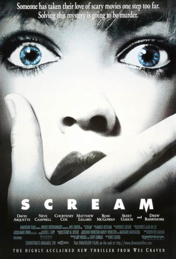
Director : Wes Craven Release Date : December 1996 Synopsis : The sleepy little town of Woodsboro just woke up screaming. There's a killer in their midst who's seen a few too many scary movies. Suddenly nobody is safe, as the psychopath stalks victims, taunts them with trivia questions, then rips them to bloody shreds. It could be anybody... The mood that is set from this poster is mystery, this is due to the mysterious hand covering the girl's (Drew Barrymore) face. The black and white colouring of the poster infers even more mystery as there no colours to be traced back to, however the only other colour present is the girl's blue, glistening eyes. This effect connotes that this is her last bit of soul coming out of her body, suggesting that every other part of her has been taken ; perhaps her innocence. The close-up of her face shows her shock and cry for help through her facial expression. There is no setting to this poster as the close-up image of the girl takes up the whole of poster, this adds more mystery to the scene. The long tagline at the top of the poster gives us an insight about what the film could be about without giving too much away. The play-on words instantly tell us the genre and the fact that there will be murders throughout the film. The 'Highly acclaimed' critics review tells the audience that this film is worth the watch as a professionals opinion is trusted and important. The 'M' in the title (SCREAM), has the middle of it pointed, this makes the letter look like a dagger which is a significant weapon as the antagonist uses a knife/dagger to kill his victims in this film. This is also a phallic symbol which further connotes that the killer is a male and how male power dominates women. 
|
|

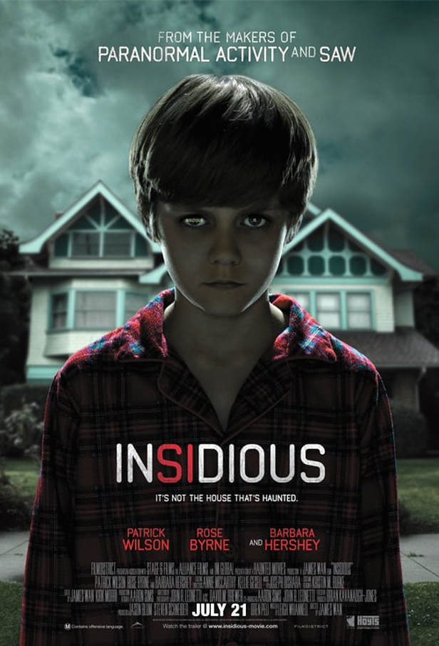
Film : Insidious
Director : James Wan Release date : April 2011 Synopsis : Parents (Patrick Wilson, Rose Byrne) take drastic measures when it seems their new home is haunted and their comatose son (Ty Simpkins) is possessed by a malevolent entity. The poster sets a distressing mood due to the young boy staring into the camera in a emotionless manner suggesting he is not alive inside, this would make the audience anxious because of his piercing eyes. The lighting in the poster is unusually lighter than most horror posters, this is to enhance and emphasise the images used in the poster ; the boy and the house in the background. However, the dark clouds behind the boys contrasts against the house which connotes that evil is near the boy/house. The big house looks like a typical haunted house used in most horror films, this means that the film is following the conventions of a horror film by including it in the poster to make it obvious. Also, the contrasting colours of light and dark (white and black) suggest the fight of good vs evil which is apparent in this film. The dominant image is of a young boy, dressed in nightwear gazing into the camera, almost as if he is possessed. Right underneath the image is the tagline which links with the suspicion of possession, indicating that the boy is haunted, not the house. This subverts the stereotype of children being pure and innocent and the possession of the boy challenges the stereotype.The secondary image is the house which tells us that it is set in there. The sell line that reads 'From the makers of...' is a very useful strategy as it grabs the audiences attention by highlighting other successful and well known horror films like Paranormal Activity. This gains the audiences trust for the film as we know the success of the other films and assume that this film will be just as good/successful. The colour scheme of red, white and black all contrast yet suit each other, this could be a hint in what the film is about ; a mix of good and evil (black and white). The biggest piece of typography we see is the title - 'Insidious', this is the most crucial part of the poster as it introduces the audience to the new film, by making it big and bold will help divert the target audiences attention straight to that, making it memorable. |
|
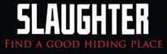
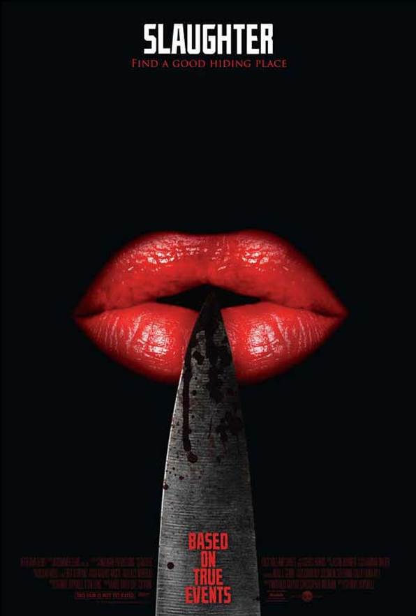
Film- Slaughter
Director- Stewart Hopewell Release date- 9th January 2009 Synopsis- By moving to a friend’s farm, a young woman looks to escape her abusive life at home. Un knowing to the fact that she will soon be experiencing much more terrifying events than her own home life. The title of this film ‘Slaughter’ although only one word, can have a much larger impact on an audience than anything else. This is because of the gruesome connotations to this name, the word ‘slaughter’ infers vicious murder and torture therefore, fan’s of the horror genre will have high expectations for this film and will want to see a horrific slasher film with blood and gore. The tagline for this film “find a good hiding place” is effective as it puts direct address to good use. Also, the fact that it is the colour of blood red is a good, conventional icon of a slasher horror film as it shows that the film will in fact include a lot of blood and graphic violence. Furthermore, the main image on this film poster is a bloody knife resting on a pair of female lips with red lipstick on them. This may represent female power; it is ambiguous as it could be showing that the antagonist in this film is a woman not a man which is unconventional. Although, it could also mean that a male is holding a woman captive and using phallic weapons to keep her in his control. This fact that the knife is blood-stained again shows that this film will be showing violence and gore. As well as this the background to this poster is plain black, this is conventional as most horror films and posters use black to portray the death and despair within the film. It also, compliments the bright red colours on the lips and knife highlighting the film as a slasher. to edit. 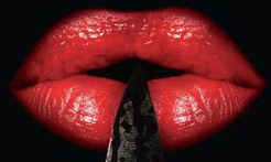
|
