Magazine Front Cover Drafts
This magazine front cover was inspirational for the designing of my drafts as it shows the main antagonist (Vampire) with the eyes as the main focus. The eyes are shown in bright red amongst the other dark colours in the dominant image which allows it to contrast and stand out. This magazine front cover does not show what the antagonist uses as a weapon to attack his victims so I didn't add any weapons on my magazine drafts.
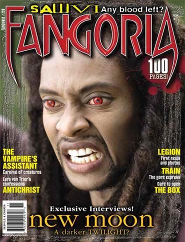
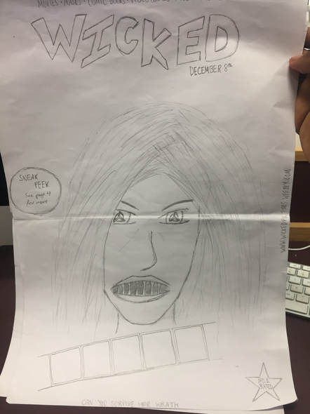
This is the first hand drawn magazine draft and this one was inspired mainly by the Fangoria magazine, as the dominant focus of that magazine is the models eyes. This led to me attempting to recreate this is my own way. In my design I only added the antagonists eyes and mouth, this was to keep the identity of the antagonist hidden and it helps to build fear within the audience as the antagonist could be anyone in the film/trailer. The fact that the antagonist has a third eye is very intriguing which will attract an audience and ignite their interests. This magazine draft doesn't show a weapon, but instead, it shows the eyes with weird shapes in the pupil which seem as if they have some sort of visual prowess.
|
This magazine front cover is effective as it shows the antagonist emerging from a dark background which shows the darkness. The dominant image takes up two-thirds of the magazine and the model is showing a direct mode of address.
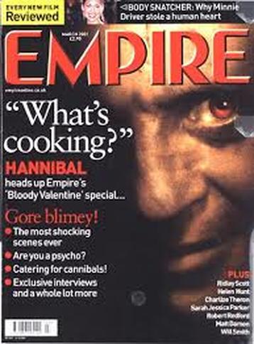
I took inspiration for my magazine front cover designs from Empire and Fangoria. This is due to the dominant image denoting the models face in a close up which concentrates on the eyes. This is very affective as many emotions can be portrayed through the use of eyes. In these examples, we see that the models have red eyes which shows a demonic/sinister nature. This allows the audience to associate the magazine with the horror genre.
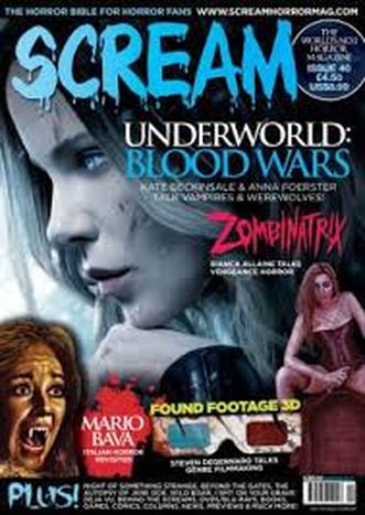
This magazine made by 'SCREAM' is very effective as the dominant image takes up the whole background which allows the audience to focus mainly on the features of the model.
|
Magazine Digital Draft
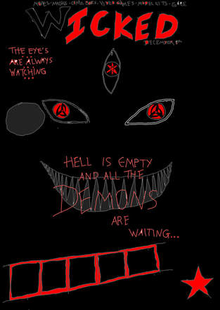
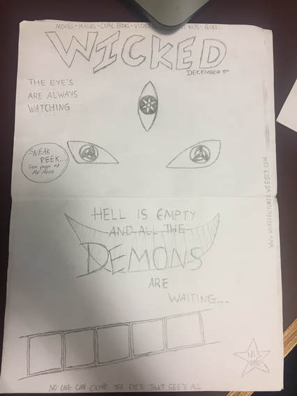
The designs for my magazine show the main features/scary aspects of the antagonist. The Demonic eyes are shown on both the posters and magazines as it allows the audience to associate those eyes as an icon of our trailer. This poster was drawn using photo shop in order to digitally recreate the first drawing that was hand drawn. I also used photoshops palette in order to add colour to the drawing; putting red, black, grey and white where appropriate.
|
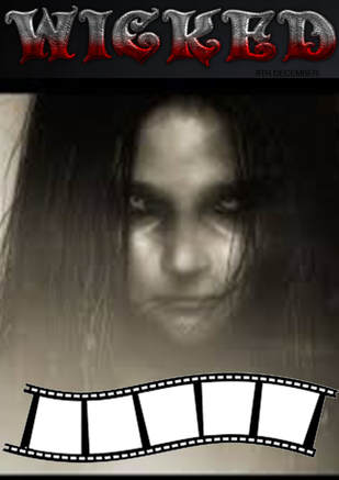
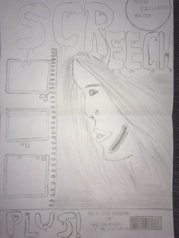
This is a digital draft for the second hand drawn design. This digital draft was made by using different images which I was able to find on the internet such as the 'scary girl' and the 'film reel'. The masthead was made by going on a website called 'cool text' and finding a design that was suitable for the magazine.
|
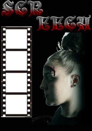
This is the third digital draft that was made. This digital draft was made using both, images I found online and a photo which we took ourselves. The dominant image was taken by our group and the make-up was also done for the magazines purpose. We used our own image for the dominant image as it was difficult to find existing images that were as close as possible to the hand drawn draft.
|
Olivia Middleton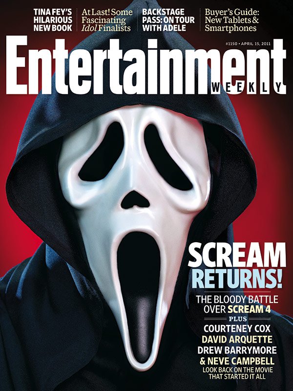
|
|
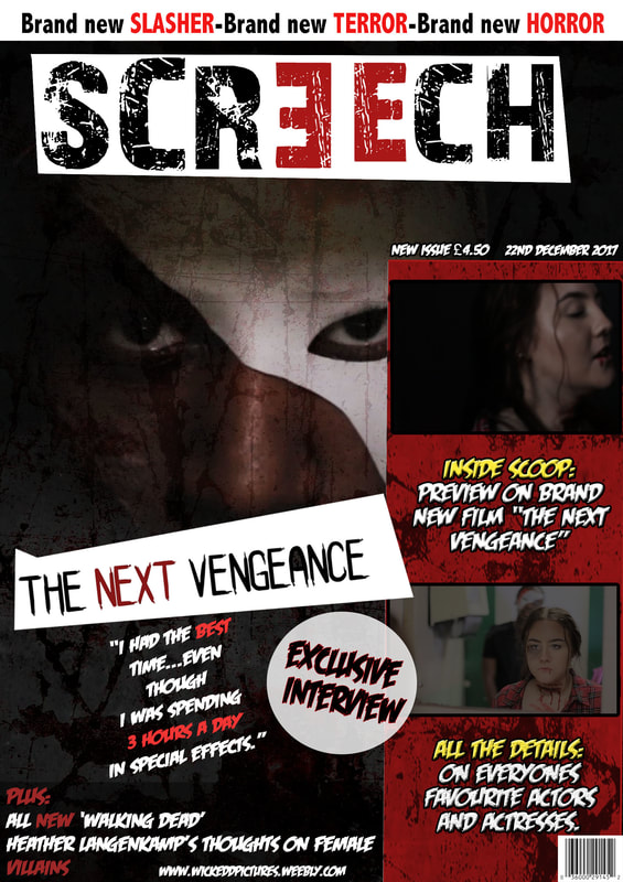
I got my ideas for this draft from the magazine Entertainment Weekly, I liked the conventions on this cover because they appear to be professional and well polished. I have shown the similarities between my draft and the magazine through the use of layout, colour scheme, typography and image.
The typography I used on the draft magazine is closely linked to Entertainment Weeklys fonts. The font I used was called Bebas Neue, this made the cover look neat and stylish also, I used the margin to help me line up the writing so that it was all straight and not wonky looking. This again allowed the magazine to appear professional. The other fonts used on the page are not italic or with little flicks, this was so that it imitated the Entertainment magazine and mirrored other magazines.
Furthermore, the colour scheme of the typography is influenced by the Entertainment Weekly, rather than mimicking the blue and white I used red and white to incorporate the conventional colour (red) into the cover, this emphasizes the slasher sub-genre as it signifies blood and violence. As well as this I added the the PLUS! and FREE POSTERS! to add more conventional aspects to the cover as these are typically used on most magazines.
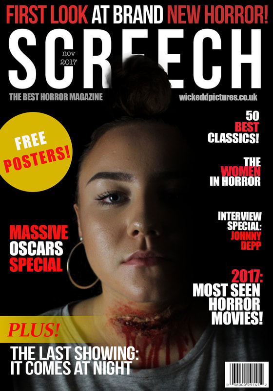
The dominant image is very similar to the Entertainment Weekly cover, it is the center image and takes up most of the page. This therefore means that the audience will automatically be drawn to it and will be able to see that this is in fact a horror magazine and that the sub-genre is slasher due to the slash on the neck. Also the background is black and it shows the right side of the images face has been shadowed, this adds an eerie effect to the magazine as it implies something may be lurking in the back (behind).
As well as this the layout of my cover shows writing on both sides rather than just a small bit in the corner, I did this so that it looked full and more interesting as the Entertainment Weekly has failed to do. People viewing my draft will be content with the amount of information given to them, where as Entertainment Weeklys viewers might be under whelmed with the lack of information shown. Furthermore, the majority of the page is covered with an image or captions, this is to make sure that the draft does not look empty.
The typography I used on the draft magazine is closely linked to Entertainment Weeklys fonts. The font I used was called Bebas Neue, this made the cover look neat and stylish also, I used the margin to help me line up the writing so that it was all straight and not wonky looking. This again allowed the magazine to appear professional. The other fonts used on the page are not italic or with little flicks, this was so that it imitated the Entertainment magazine and mirrored other magazines.
Furthermore, the colour scheme of the typography is influenced by the Entertainment Weekly, rather than mimicking the blue and white I used red and white to incorporate the conventional colour (red) into the cover, this emphasizes the slasher sub-genre as it signifies blood and violence. As well as this I added the the PLUS! and FREE POSTERS! to add more conventional aspects to the cover as these are typically used on most magazines.
The dominant image is very similar to the Entertainment Weekly cover, it is the center image and takes up most of the page. This therefore means that the audience will automatically be drawn to it and will be able to see that this is in fact a horror magazine and that the sub-genre is slasher due to the slash on the neck. Also the background is black and it shows the right side of the images face has been shadowed, this adds an eerie effect to the magazine as it implies something may be lurking in the back (behind).
As well as this the layout of my cover shows writing on both sides rather than just a small bit in the corner, I did this so that it looked full and more interesting as the Entertainment Weekly has failed to do. People viewing my draft will be content with the amount of information given to them, where as Entertainment Weeklys viewers might be under whelmed with the lack of information shown. Furthermore, the majority of the page is covered with an image or captions, this is to make sure that the draft does not look empty.