On this page, our film, 'The Next Vengeance' will be exhibited in many media formats,as well as the media products that each individual was inspired by. Throughout the page, we focused on the synergy, continuity and identity of all our products that we have created. Synergy and continuity are important for the identity and branding of our trailer, poster and magazine.
We will also be putting our focus onto media convergence as well; media convergence is when different media platforms are merged in order to produce new forms of media expression.
In this page we will be presenting brand identity for our film 'The Next Vengeance', where we will also be comparing our own products with real media texts.
By Elif Cengizler
Examples of SYNERGY and MEDIA CONVERGENCE by Olivia Middleton

SUCCESS OF OTHER REAL MEDIA TEXTS
|
|
|
By Olivia Middleton
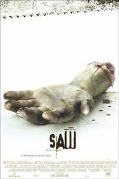
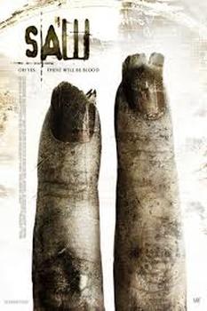
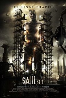
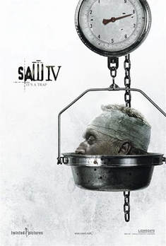
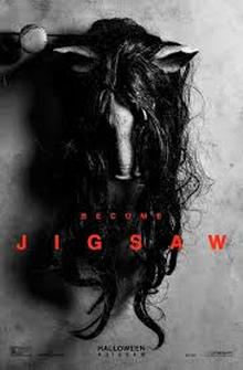
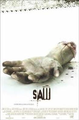
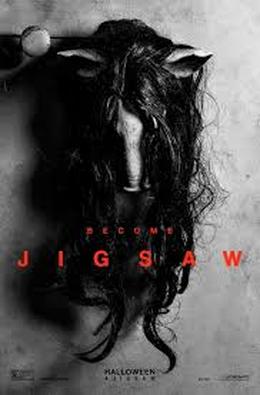
SAW is an American horror franchise that has 8 different movies, it also had Lionsgate as their distributor. Currently this famous franchise has made $873.3 million worldwide, with its most recent product 'Jigsaw' set to make $20 million.
|
|
|
|
SAW's most recent film 'Jigsaw' was released in 2017.
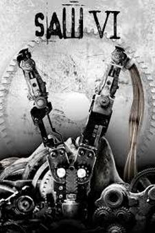
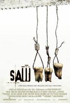
EVOLUTION OF THE POSTERS
|
As you can see these are the earliest (first film) and the most recent SAW posters. There is a clear difference between the two, we can see how the posters have appeared to evolve from the recognisable severed limb to what seems like a pigs head mask which is the well-known mask of 'Jigsaw'. This could suggest that considering there are in fact 8 SAW films now, this will be the last one as it is picturing the killers conventional prop hanging up as if he is now done with the actions that he has been taking over the many years and film productions.
|
|
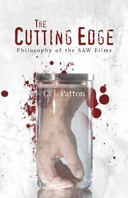
There is also a book based on SAWS philosophy, it analyzes and reveals deeper meanings of the situations within the films. As well as, comparing the movies concepts to the historical philosophers ideas from previous years, there is a section of the famous SAW deathtraps. |
These are some parodies of the film SAW. The public have created these, it shows just how dedicated the fans of the film franchise are as they are taking the time to make humorous re-makes of it.
|
|
|
By looking at these re-makes and the plenty others on Youtube, it is clear that SAW is a popular franchise that has a wide fan base.
As well as parodies, fan fiction is a worldwide hobby of some audiences and fans. There are thousands of websites surrounding SAW fan fiction, this then pushes SAW to be even more popular than it already is by continuing its advertisement.
|
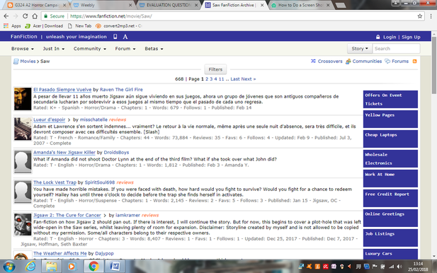
|
MEMORABILIA/MERCHANDISE
These products show that the SAW franchise has a large fan base so much so that, the items shown are priced at astronomical costs such as, $428.99, the most expensive item being $2,500. The fact that people are willing to pay these prices for merchandise and memorabilia suggests that there is quite the committed audience attached to it.
BRAND IDENTITY
|
SAW have used the same typography on each poster, this is to keep the brand identity the same all the time in order for it to be recognized as the SAW franchise. This is a very important factor with any film, as it allows audiences and fans to automatically identify with the film.
|
|
By Elif Cengizler
|
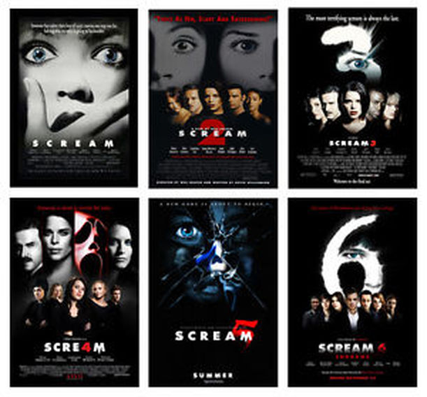
Scream is the iconic 1996 Slasher classic which was noticeably different to the other classic horror films back in the 90's due to its added comedy as well as the iconic mask used by 'Ghostface'. The slasher film developed into a franchise with four of the films using the same main character, 'Sidney Prescott' played by Neve Campbell, using her continuously as the main character secures their fan base as the films die-hard fans would still want a sense of the classic first film. This film franchise became so popular that they released a wide range of merchandising and memorabilia and is now a typical, classic Halloween costume for fans of the film. Furthermore, there has also been a parody franchise of Scream (Scary Movie) which is a tribute to the film, still using similar named characters and other elements.
Scream has a specific yet simple house style using the main colour palette of black, white and red which can be seen throughout all of the Scream movies in the franchise. By doing this, it allows the films merchandising and memorabilia to have a consistent theme, following the recognisable look of the Scream films., this allows for the franchise to create synergy to be embodied into the merchandising and memorabilia, creating the products to be easily identifiable in terms of the franchise. |
|
PROFIT
|
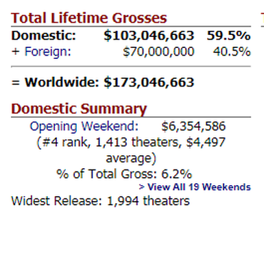
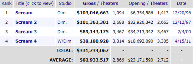
The images to the right shows the gross compiled across the whole of the Scream franchise, as well as the opening weekend box office. However, the money from merchandising/memorabilia and products made from the outcome of the film is not included in these totals.
The production budget for the first 1996 Scream film was a total of 15 million USD, being the least out of all the production budgets for the whole franchise. The gross of a film is extremely important as it informs major companies on the films success, indicating if there should be another film made. The Scream franchise has been very triumphant as the whole of the franchise achieved over 600 million USD worldwide, however Scream 4 did the worst with only 97 million USD made world wide. 
|
|
PARODIES/SPOOFS
|
|
|
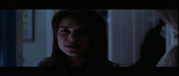
As you can see, the opening scenes for both of the first Scream film and Scary Movie, are extremely similar, making it obvious that 'Scary Movie' is a parody of 'Scream'.
Scary Movie was released in 2000 which was directed by Keenen Ivory Wayans. The film is a parody of the horror and slasher genre. The script was primarily based off on Scream (1996) and the classic horror, I Know What You Did Last Summer (1997).
|
|
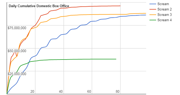
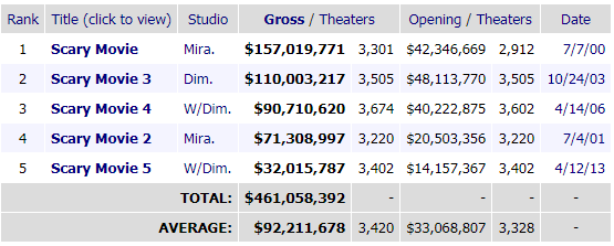
The screenshots above show the box offices for all of the Scream films as well as all of the Scary Movie's side by side, as you can see, the first Scary Movie achieved a bigger box office.
By parodying a film, it brings attention to the initial film again, despite when it might of been released, this means views will still be rising for the original film, still earning it money and profit over time.
MERCHANDISE AND MEMORABILIA
|
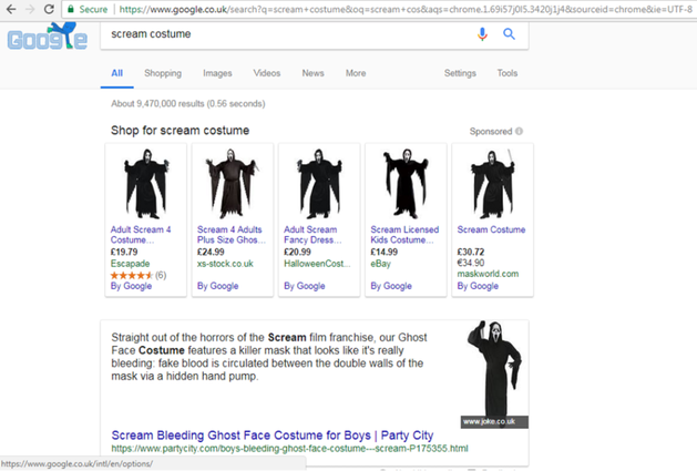
When 'scream costume' is typed into Google, over nine million results show up, presenting all the fancy dress costumes that are up for sale, some of these costumes include the 'GhostFace' costume and the same 'GhostFace' costumer, however made for females, allowing both genders to feel comfortable representing one of their favourite films.
Scream became increasingly popular over the years, since it was released, it even has a dedicated fan page named 'ScreamWiki' (http://scream.wikia.com/wiki/Thread:67918) where it gives detailed information on the franchise as well as every single episode in the TV show that was released, created by MTV (developed by Jill Blotevogel, Dan Dworkin and Jay Beattie), basing their antagonist as 'GhostFace', just like the films in the iconic franchise. The site also allows the public to view unseen images from the franchise, as well as giving hidden background information on every single character that is important in the Scream franchise. |

SCREAM TV SERIES
Scream 2015 is an American Slasher television series developed by Jill Blotevogel, Dan Dworkin and Jay Beattie for MTV. The TV series is based on the iconic slasher film franchise which was directed by Wes Craven, this is why the TV series and the franchise share the same name.
This TV series is one of the most popular products produced from the film franchise as it can be viewed from the streaming service; Netflix, where it gives all the most recent episodes and seasons. This synergy benefits both Netflix, MTV and the creators of the Scream franchise. Netflix is the most easily accessible service for the public to watch the TV show, still giving tribute to the film franchise, allowing people to feel nostalgic and re-watch the old films again in order to reminisce on their favourite horror classic.
Throughout the TV series, elements of the original franchise can be spotted, keeping the same textual and visual denotations, such as the main plot and characters, there are still some differences from the film version of the TV series. For example, the target audience for the TV series is now aimed at the contemporary teenager, by including technology from today's era like iPhones.
SCREAM MOBILE GAME
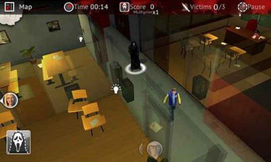
Also on 'ScreamWiki', it reveals information on a Scream 4 inspired mobile game, it says 'Scream 4, stylized as SCRE4M, was a mobile game companion app developed by The Weinstein Company (TWC) Games, Beefy Media and Codeglue in promotion for the film of the same name. Developed on the Unity game engine, the game was released for iOS and Android on June 6th, 2011.' Furthermore, it describes the gameplay, and discusses the different levels that can be played in the game. Also, a video was featured on the page, allowing fans to watch another player play the game, discussing the features of the game and all the levels as well as the characters.
|
|
|
BRAND IDENTITY
|
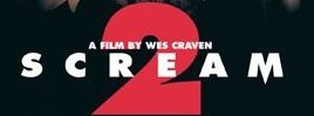
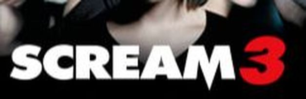
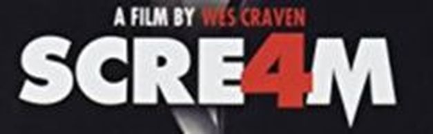
Brand identity is what makes a product instantly recognisable to the brand's target audience. The audience will associate their brand identity with the products that have been created (trailers, posters, and other advertisements), and that identity is what forges the connection between the brand and their audience. Scream has the very recognisable, bold font with the letter 'M' made to look like a weapon, perhaps a dagger/knife, just like Ghostface's iconic weapon. Furthermore, it is evident that the numbers for Scream 2, 3, and 4 are all also in bold as well as being red, depicting blood and danger. Scream 3 also carries on the tradition of having a sharp, pointed edge in the middle of the number 3 which also represents Ghostface's weapon. By continuously having the same style font for the film, it allows the films target audience to easily identify the film, just by simply looking at the colour scheme as well as the font. |
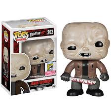
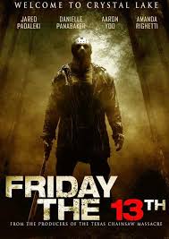
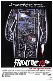
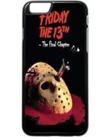
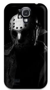
FRIDAY 13th by thajjay thompson
|
|
|
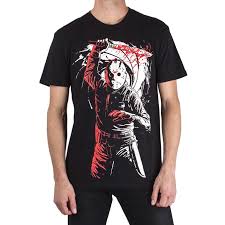
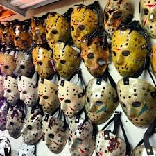
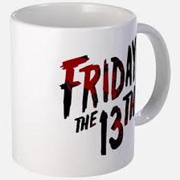
Friday the 13th is an American horror franchise. The franchise mainly focuses on the antagonist character, Jason Voorhees. The friday the 13th film franchise has grossed over $64million at the box office worldwide. The franchise is also considered one of the most successful horror film franchises in the US and this is due to the multiple approaches it has taken to merchandising. Examples of merchandise for Friday the 13th are T-shirts, mugs, and masks.
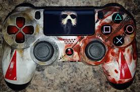
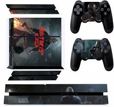
The video games for Friday the 13th were released shortly after the film which had its latest release of May 26th 2017. The video game works in synergy with the film, so it follows the same story and this also means that the game will have an existing fan base and therefore increased marketing and promotion. There will also be hype for the game as fans will watch the film first and then they may want to play the game to be more involved with the experience.
The game was released on 3 platforms, PS4, XBOX and PC which allows users from all free platforms access to the content.
The video shows fans of the Friday the 13th franchise playing the game on release and uploading their opinions and playthrough of the game. This acts as increased marketing and word of mouth promotion for the game as it allows the fans to receive the views of other fans through youtube. Youtube is the biggest and most popular website for browsing videos so the gameplay has the potential to receive millions of views. This also allows those who have not watched Friday the 13th but have played the game, a chance to experience the same feelings as the film might make them feel.
|
|
|
|
|
|
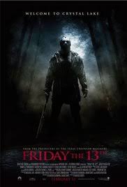
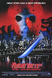
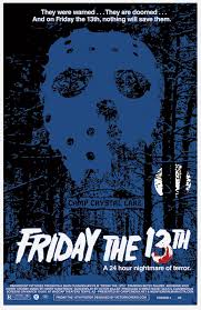
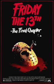
These are posters from all the different Friday the 13th releases. The posters show the franchises technological and time period development. For example, the older posters seem to be much more creative and complex even though the technology used wasn't as advanced as modern day. On the other hand, the modern day posters are much more simplistic and empty even though the producers have access to much more powerful technology.
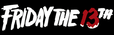
TYPOGRAPHY-Friday The 13th
From looking at all the different Friday the 13th posters, it is clear that they use the same font and this is due to it being iconic and recognisable to existing Friday the 13th fans. Using the same typography is also beneficial to the Friday the 13th franchise because it means that other production companies can also use the same typography when creating merchandise which is both beneficial to the franchise and the manufacturers of the franchise as there is an existing consumer base. The colours used on the Friday the 13th titles are usually white with red blood splatters on the 13 but there are also titles that are completely red.
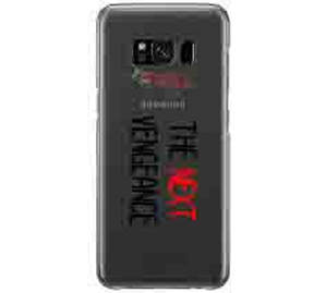
TYPOGRAPHY-The Next Vengeance
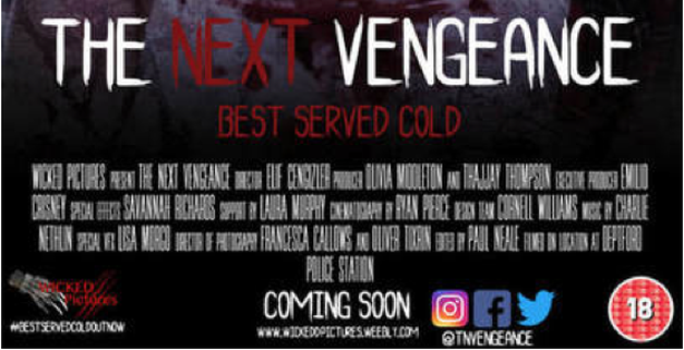
When deciding on our own typography, we used real media texts such as Friday the 13th for inspiration. From looking at RMT, we saw that every thing relating to the movie/trailer, had the exact same design of text, for this reason, we made sure our magazine, trailer and poster all had the same typography on them so that it's recognisable as being from the same production company.
FILMS+MERCHANDISE PROFIT
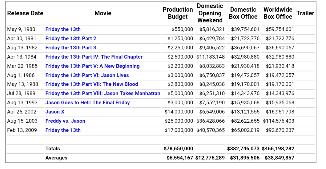
This image shows the total box office from all the Friday the 13th films in the franchise, including the spin-offs. This also shows the the latest film was successful without the need of merchandise and video games as globally, the film made more than double that of its production budget. On the other hand, the use of merchandise and games were advantageous for the franchise as it extended the life cycle of the latest film as fans had more to look forward to such as cosplay and mimicking scenes while playing the game.
The merchandise that has since been released for Friday the 13th has grossed approximately a further $125million and this was possible as there were more than 100 licences sold to production companies allowing them to produce Friday the 13th related products, this meant that the markets were full of products for all Friday the 13th fans from cups to clothing.
The merchandise that has since been released for Friday the 13th has grossed approximately a further $125million and this was possible as there were more than 100 licences sold to production companies allowing them to produce Friday the 13th related products, this meant that the markets were full of products for all Friday the 13th fans from cups to clothing.
COMPARISON OF REAL MEDIA TEXTS AND OUR PRODUCTS
TRAILER AND POSTER
By Elif Cengizler
By Elif Cengizler
|
|
|
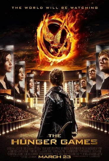
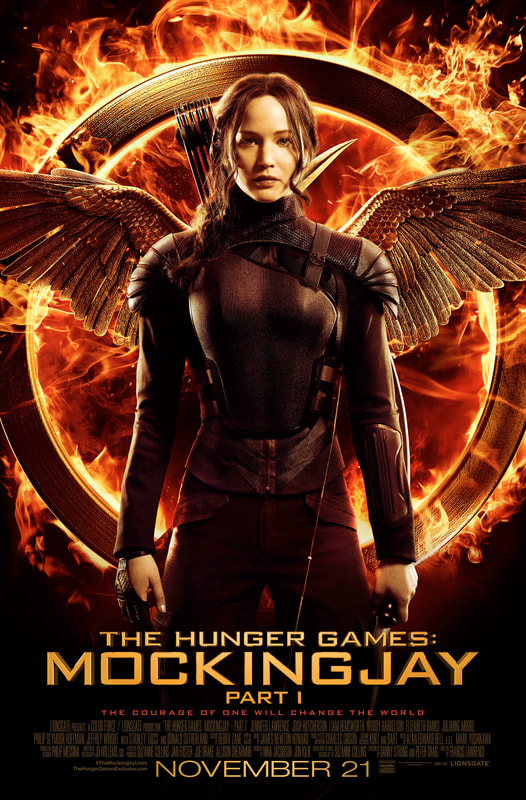
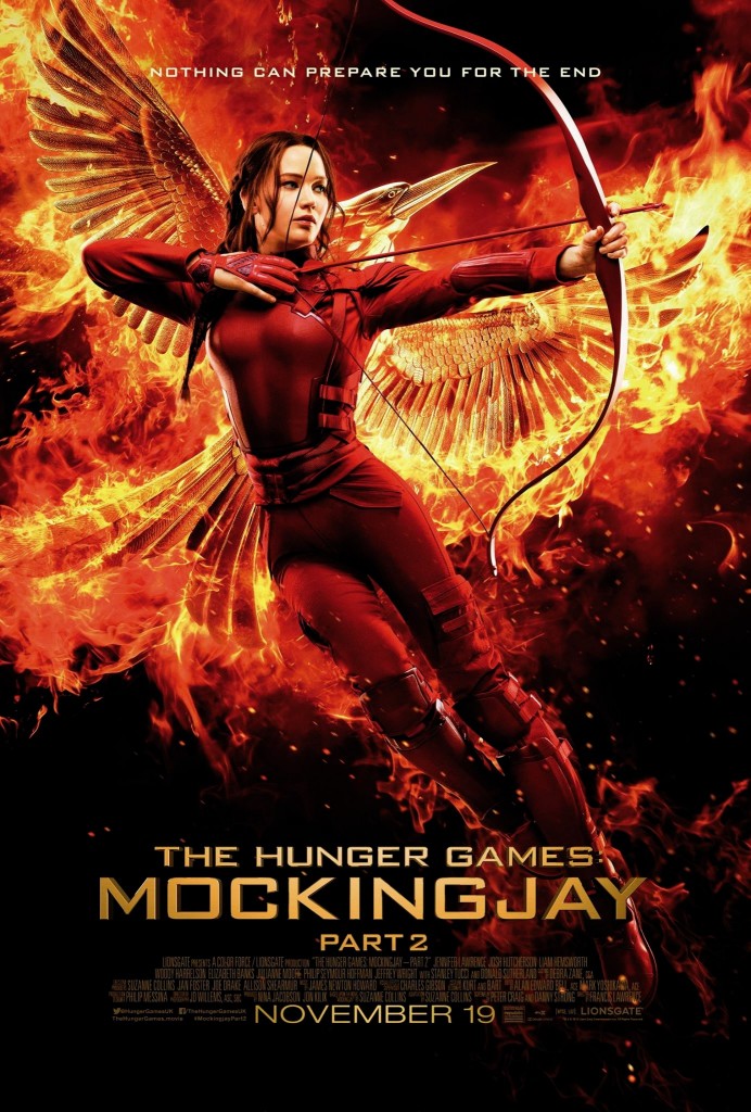
Typography/Font: As you can see, the same, large, block, golden font is used in all of the trailers for The Hunger Games franchise, as well as the posters too. By using the same font consistently for the posters and trailers, it creates brand identity, meaning that this font will be known for being used for the coming of age franchise.
Characters: As you can see, there is one character who seems to appear on all of the posters for the whole franchise; the main character who happens to be the protagonist as well. However, in the first poster, it can be seen that there are other characters as well, this is because they're first being introduced to us, the viewers, whereas, the other posters are the main character only as we now have established that she is the most important as well as most identifiable character.
|
|
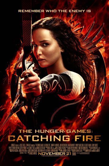
Colour scheme: It is highly obvious that the same colour scheme of warm tones (red, yellow, orange and black, which signify fire) is used regularly throughout the franchise, which links to the main character's (Katniss Everdeen) coal mining background. By having the same, continuous colour scheme throughout the franchise (including posters, trailers and other types of advertisement) allows their target audience to familiarise themselves with the colours so they can easily identify the film, solely by looking at the colours of a poster.
Characters (carried on): Furthermore, along with the character comes with her weapon, the bow and arrow, which is significant in the film, indicating to the viewers that she is strong and powerful.
|
OUR PRODUCTS
By Elif Cengizler
By Elif Cengizler
|
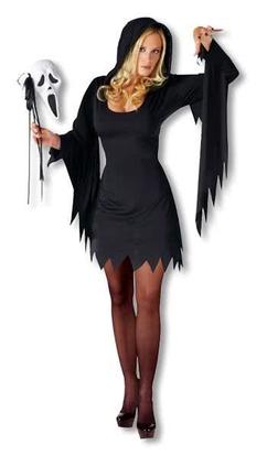
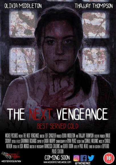
Typography/Font: As you can see in the GIF's above and the poster to the right, we have used the same, scratchy, bold typography in all of our products. By having clear consistency throughout our media platforms where our product is going to be presented on, it creates brand identity where the typography becomes known for being used in our horror film, making it easily identifiable to the public.
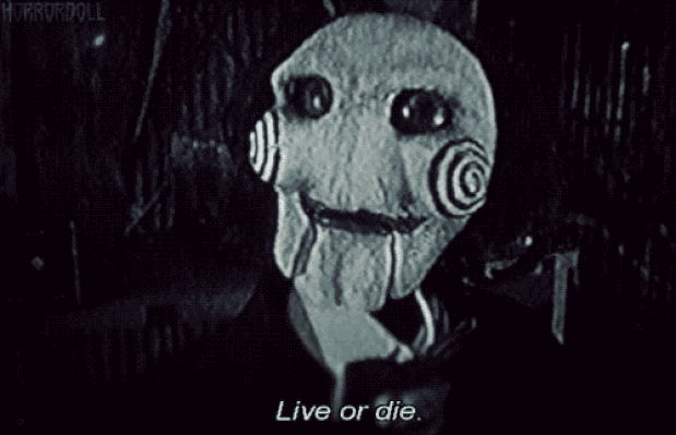
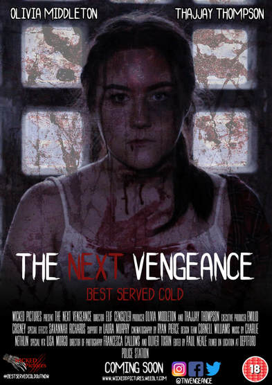
Characters: We made sure that we used our main character who is the protagonist in the majority of advertising our product. For example, we used the protagonist on the poster, so people can easily identify her as the 'good' one. Furthermore, in our trailer, we try to draw attention away from the antagonist by making him less visible, we did this by using low-key lighting around him, as well as using dark clothing for his costume. We did this to keep him a mystery where we would have people guessing what he is; a killer? a monster?
|
|
Colour Scheme: Our product's colour scheme includes red, black and hints of blue. We used this colour scheme as when we asked in our questionnaire which colour scheme fitted the best with our film idea, this mix was chosen the most out of an array of different colour schemes. By using red, it indicates blood and danger, black suggests mystery and death, finally the hints of blue sets an eerie, cold atmosphere, which can be seen on the poster as well as the trailer (all of the colours listed are very visible in the thumbnail for the trailer.)
Moreover, we achieved the best shots/footage in our trailer by using low-key lighting which is a typical convention of a horror trailer. Doing this ensured our trailer to give off an eerie type of atmosphere. This leads it up to the montage where all of the more 'visible' footage can be seen, for example, the antagonist walking with his weapon, covering his face but still being very visible because of the high-key lighting used. |
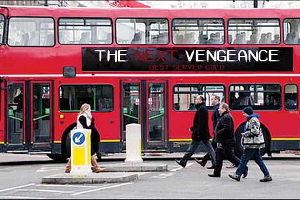
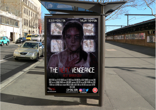
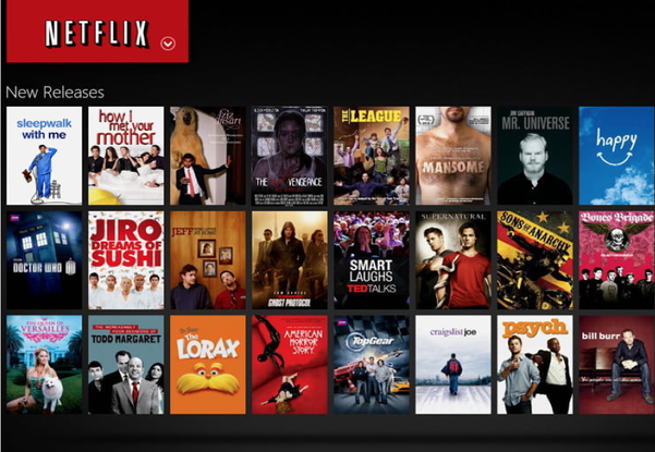
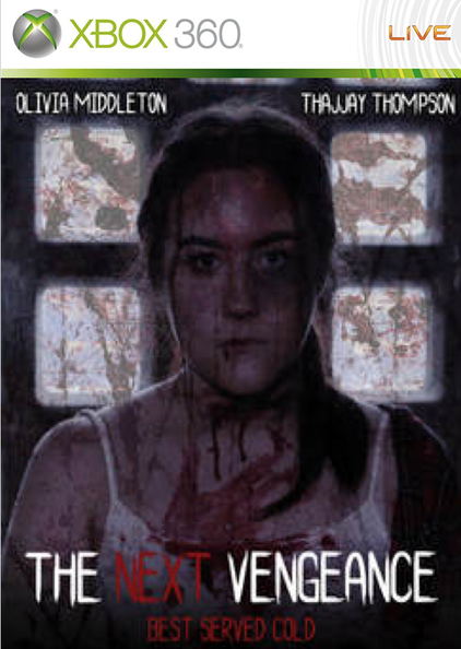
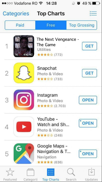
SYNERGY THROUGH MEDIA PLATFORMS by Olivia Middleton & Thajjay Thompson
|
|
|
|
|
I have used a variety of media platforms to apply my product to, these include; a bus poster, a bus stop billboard, an Xbox game and the Netflix home page. These are all typical types of promotional stages that franchises eventually go through, all in order to make more and more money as there is more attention brought to it from its audience. While having the poster advertised on buses and bus stops, there is a certainty that a large amount of publicity will be brought to it by the general public who are walking past or waiting for buses etc. Furthermore, you are also able to see the actors/actresses on the poster meaning that anyone that has an idea about who they are or recognises them will automatically be interested in the film especially if they are fans of them. This is a very effective way of advertising a film or product because it allows a mass audience to view it and get information for it.
|
|
|
|
|
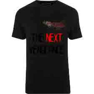
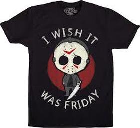
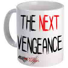
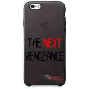
Here you can see merchandise from Friday the 13th and our own versions of those merchandise. Merchandise is used to extend the life cycle of the movie as well as increase hype. Merchandise also plays a big part for fans as it allows them to feel interactive with the world of the movie; through clothing (cosplay), accessories and dining(mugs). By offering merchandise for our production, it allows us to increase our marketing for the film as it becomes readily available online and in-stores. Merchandise allows fans/customers to boast about or show off their interests in a particular film, this also acts as further advertisement(word of mouth)for the production company, this would also lead to an increase in fans and therefore the producers would need to make a part 2. For example, The Next Vengeance 2.
|
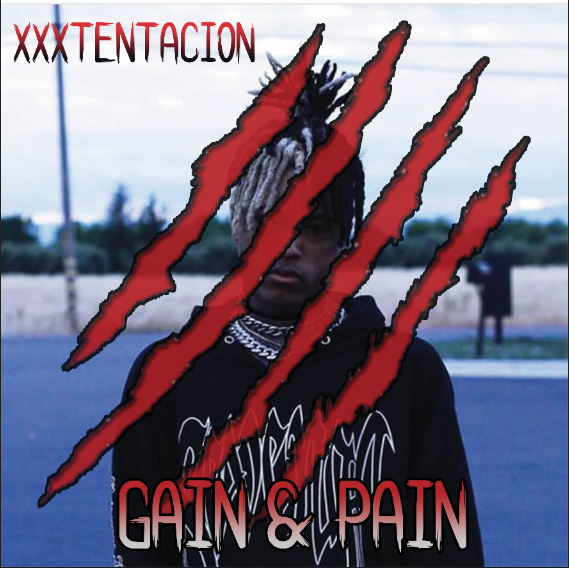
Our soundtrack included XXXTENTACION. We kept the brand identity the same throughout our production, therefore including our recognisable claw/scratch mark and continuing the colour scheme. The typography used to write "XXXTENTACION" and "GAIN & PAIN" is also the same as the rest of the production for example, the title slates and the poster.
|
OUR OWN SUBSIDIARIES
By Elif Cengizler
By Elif Cengizler
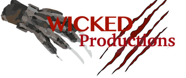
Wicked Productions have shown good understanding of branding amongst media conglomerates, media groups or media institutions. We have chosen to adapt our production company, Wicked Productions, into a subsidiary of a large media corporation, where we were inspired by many already existing multinational media corporations. This did in fact help us to make our production company into a successful one.
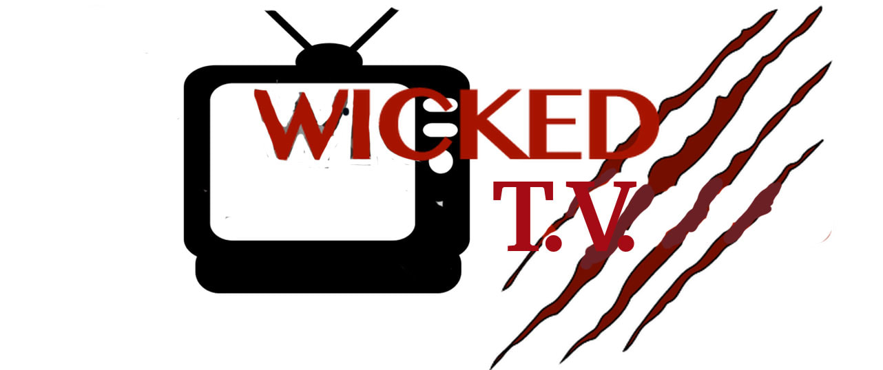
Wicked TV has one of the largest viewing platforms. We are able to make profit by distributing various items such as; normal DVDs and Blu-ray DVD's, 3D DVD, Netflix and Amazon Prime. By locating the TV image on our logo, we are again able to continue promoting our product. Furthermore, we are able to continue our profit making by show spoofs and parodies, also bringing recognition back to the originals.
|
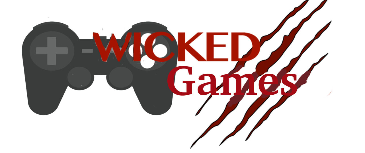
Wicked Games is an gaming company that has an assortment of computer games, video consoles and much more. We are able to create a video game, inspired on our film The Next Vengeance where we could use the characters in the film. By doing this, it creates synergy which allows to bring up the profit for the film. This is also an example of this logo having a brand identity as it is similar and has taken inspiration from the original 'Wicked Pictures' logo.
Wicked Studios is a very popular music producing company in the contemporary industry. This is because they are known for their successful line of new artists who make it in the charts. Our Wicked Studios logo is similar to all of our other ones, allowing us to gain a bigger audience as people will recognise our logo.. All of our logos, this included, does use brand identity, this is because of the same feature of the claw mark, as well as the same typography. Wicked Studios being a music company meant that we could pay tribute to that by including a music note, representing what we do best.
|
